
Primitives
The card system consists of these composable primitives:
| Primitive | Description |
|---|---|
Card | Root container with border and padding |
CardHeader | Header section |
CardTitle | Title heading (renders as h3) |
CardDescription | Subtitle/description text |
CardAction | Positioned element (e.g., badge over image) |
CardContent | Main content area |
CardFooter | Footer section with actions |
Composition Patterns
Resource cards
The resource cards used across the Project Exodus website and Bridge — typed badge, cover image, title and a "Read more" link.
Basic resource card
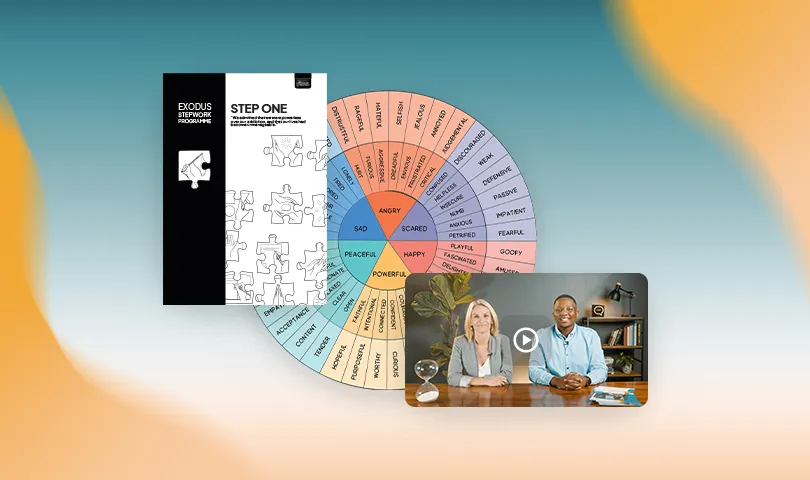
With Badge
Show the resource type with a coloured badge:

With metadata
Add the resource type and metadata (read time, file size):

Complete Example
All features together:
Collection
Display multiple resources in a grid:
Dashboard Stats Cards
Perfect for KPIs, metrics, and analytics.
Basic Stats Card
With Trend Indicator
With Icon
With Description
Dashboard Collection
Testimonial Cards
Perfect for reviews, quotes, and social proof.
Basic Testimonial
Sarah Johnson
Programme participant
With Avatar
Michael Chen
Graduate
Class of 2024
With Rating
Emily Rodriguez
Member
With Title
David Thompson
Programme alumni
2023 cohort
Testimonial Collection
Sarah Johnson
Programme participant
Michael Chen
Graduate
Class of 2024
Building Custom Patterns
The beauty of primitives is flexibility. Create your own patterns:
Horizontal Card
<Card className="flex flex-row">
<img className="w-48 object-cover" src="..." />
<div className="flex-1">
<CardHeader>
<CardTitle>Title</CardTitle>
<CardDescription>Description</CardDescription>
</CardHeader>
</div>
</Card>Minimal Card
<Card>
<CardContent>
<p>Just some content</p>
</CardContent>
</Card>Feature Card
<Card>
<CardHeader>
<div className="mb-4 rounded-lg bg-primary p-3 w-fit">
<Icon className="size-6 text-primary-foreground" />
</div>
<CardTitle>Feature Name</CardTitle>
<CardDescription>
Description of the feature
</CardDescription>
</CardHeader>
</Card>Pricing Card
<Card>
<CardHeader>
<CardTitle>Pro Plan</CardTitle>
<CardDescription>For professional use</CardDescription>
</CardHeader>
<CardContent>
<div className="text-4xl font-bold">$29</div>
<p className="text-sm text-muted-foreground">/month</p>
<ul className="mt-4 space-y-2">
<li className="flex items-center gap-2">
<Check className="size-4" />
<span>Unlimited projects</span>
</li>
{/* More features */}
</ul>
</CardContent>
<CardFooter>
<Button className="w-full">Get Started</Button>
</CardFooter>
</Card>API Reference
Card Primitives
All primitives accept standard HTML attributes plus:
| Prop | Type | Description |
|---|---|---|
| className | string | Additional CSS classes |
| children | React.ReactNode | Content to render |
Composition Tips
- CardAction: Absolutely positioned, great for badges over images
- CardHeader: Use
className="flex flex-row"for horizontal layouts - CardFooter: Perfect for buttons and actions
- CardContent: Main content area, use for body text
- overflow-hidden: Add to Card when using images for clean edges
Integration with CardCollection
All card patterns work seamlessly with CardCollection:
import { CardCollection } from "@pex/ui-web/data/card-collection";
<CardCollection variant="grid" columns={3}>
<Card>{/* Your composed card */}</Card>
</CardCollection>